
My name is John Shalkah and I’m the CEO and Founder of XELL.
Since we’re coming up to our 10th anniversary we discussed
internally that we should start a new decade with a new fresh branding that will help us through the next decade new. The branding should
reflect the following: smart, vibrant and bold. We would like a design that reflects that. One big asterisk is that we want our creative team to choose their own combo in colors, so create something
that allows for that.
For this project the goal was to develop and design the entire branding identity, website, print and help her out with her strategy.
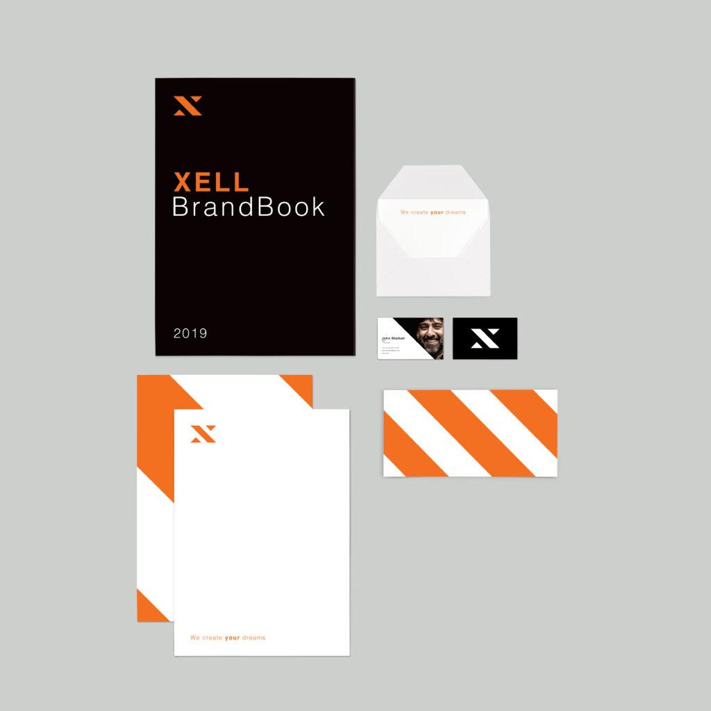
Outcome of this project is a full on branding strategy ranging with brand elementens going in to a website, business cards and brochures.
The following is the briefing I created to give myself an most realistic scenario and guidance to refer back to. This way I learn to creative to solve a problem rather than design just “pretty“ things.
Brand identity / Print / Web design / Marketing
John started this company in 2010 in New York to provide companies with a clear solution regarding their marketing, campaigns and place in todays market.
American based companies
Urban, Bright and playfull is the direction of the identity.
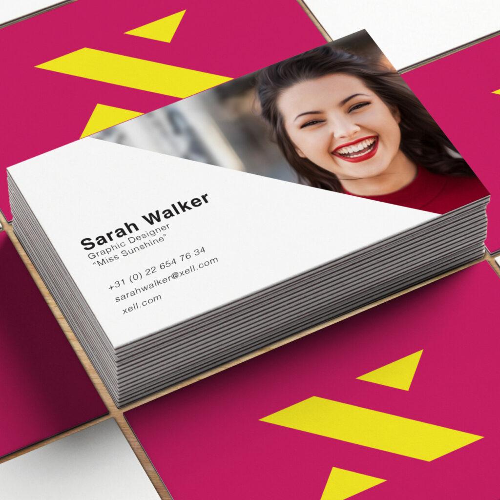
On top of each employee gets a nickname, most of them already exists in the company and this way it makes it more personal to connect with the company.
I used the slant from the logomark in the rest of the design.
I went for a vibrant, bright colorscheme that allows the employees lives and breathes boldness and vibrant. By using these colors the employees can combine colors and let that reflect their personality. This doesn’t mean its all over the place because the places that can differ in color are monitored and still all within the overall branding. Because a company survives because of its employees.
For the logo we choose a clean, simple approach. The font family I selected is Lato. This gives a clean and simple but confident and professional feel. If the practice would expanse to multiple cities the “Zwolle” could be easily updated.