Louisa Vos is a psychotrauma therapist living in Zwolle and started her own practice. She needed a full branding, from website to logo and print, to make her new clients feel at ease and to give them comfort in the treatment process.
For this project the goal was to develop and design the entire branding identity, website, print and help her out with her strategy.
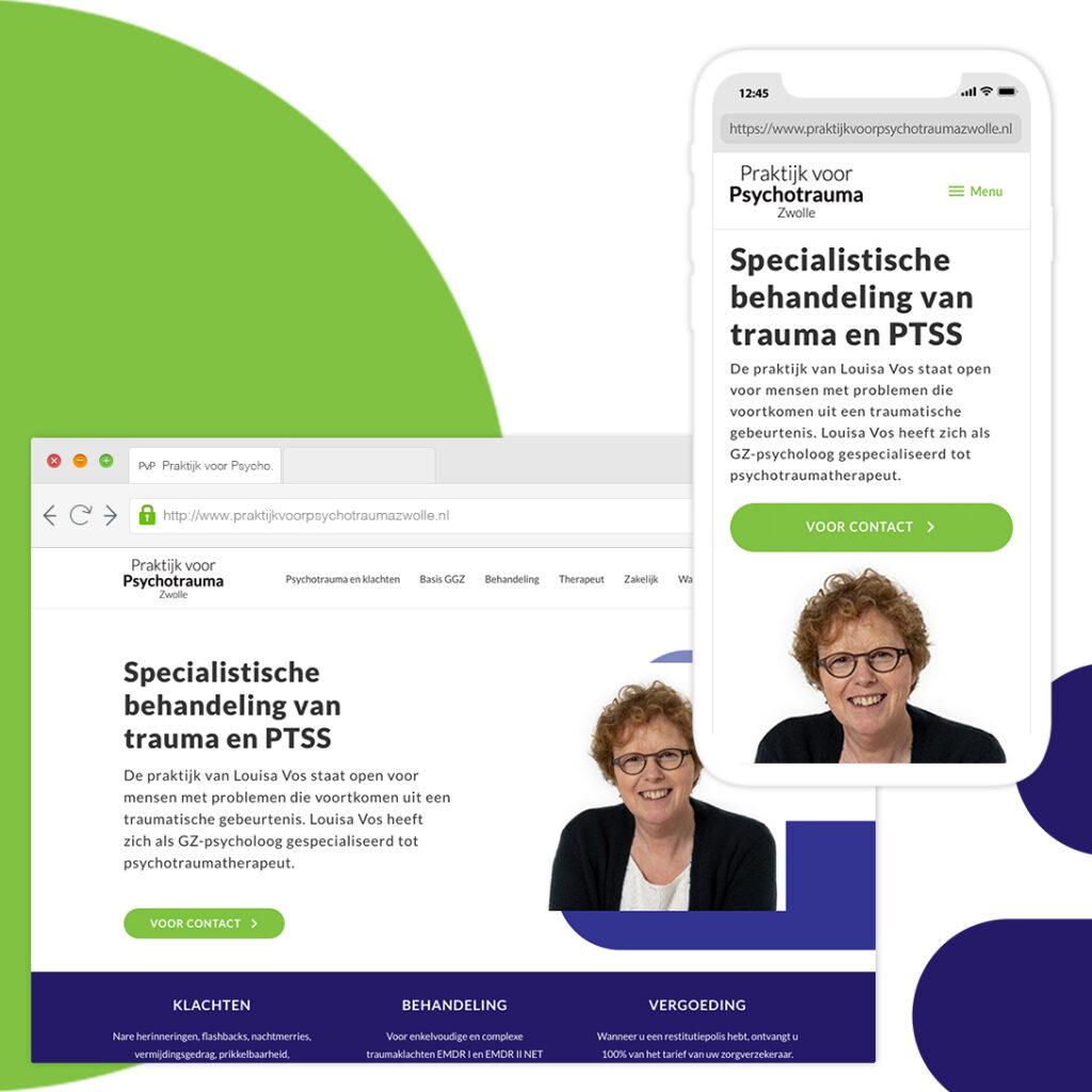
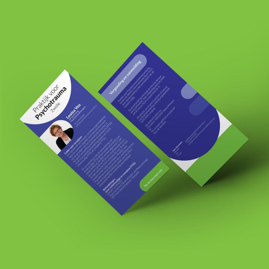
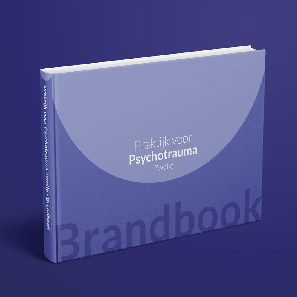
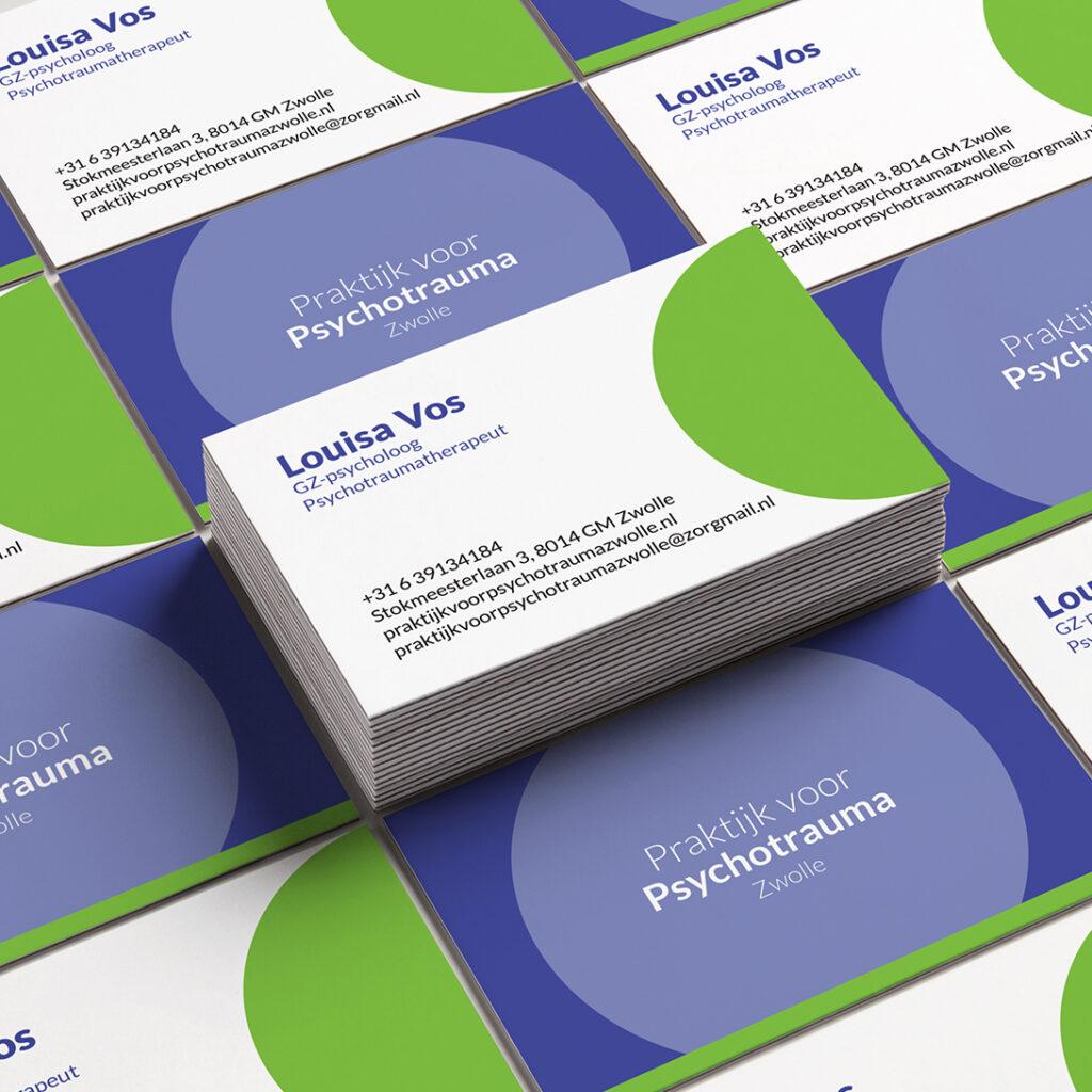
Outcome of this project is a full on branding strategy ranging with brand elementens going in to a website, business cards and brochures.
Brand identity / Print / Web design / Marketing
Louisa helps people between 20 and 60 who experienced a traumatic event and were left with problems, ranging from nightmares and unpleasant dreams to flashbacks, avoiding behavior, irritability, anger outbursts and concentration problems.
Men and women between 20 and 60 whom experienced a trauma in their life or at work.
We started with multiple discovery sessions where we would sit down to uncover what her “Why” and key-values of her and the company would be, the direction of the company, who her target group was and what that person should feel like when getting treatment at her practice.
Based on the information I got from her through her answers and my personal findings I made three stylescapes and presented this to her. Along with her feedback we combined some aspects and ended up with one final version. In this stylescape we narrowed down to the following key-values:
Reliable, Calm/Serene, Professional.
As brand elements, I introduced strokes in order to give the design more depth. The strokes are fully rounded to enhance the feeling of comfort and pleasantness the costumers (possible patients) will get. The whole experience from notice of the site to signing up and getting treatment must be pleasant, calm and most of all a reliable and professional feeling.
I choose for three shades of purple/blue. This color in its darkest form gives a sense of reliability en professionalism, than the lighter versions. Accompanied with these 3 I put a light and fresh color (also a near complement color) on the opposite of it. This color will be used in print en media to act as a call to action.
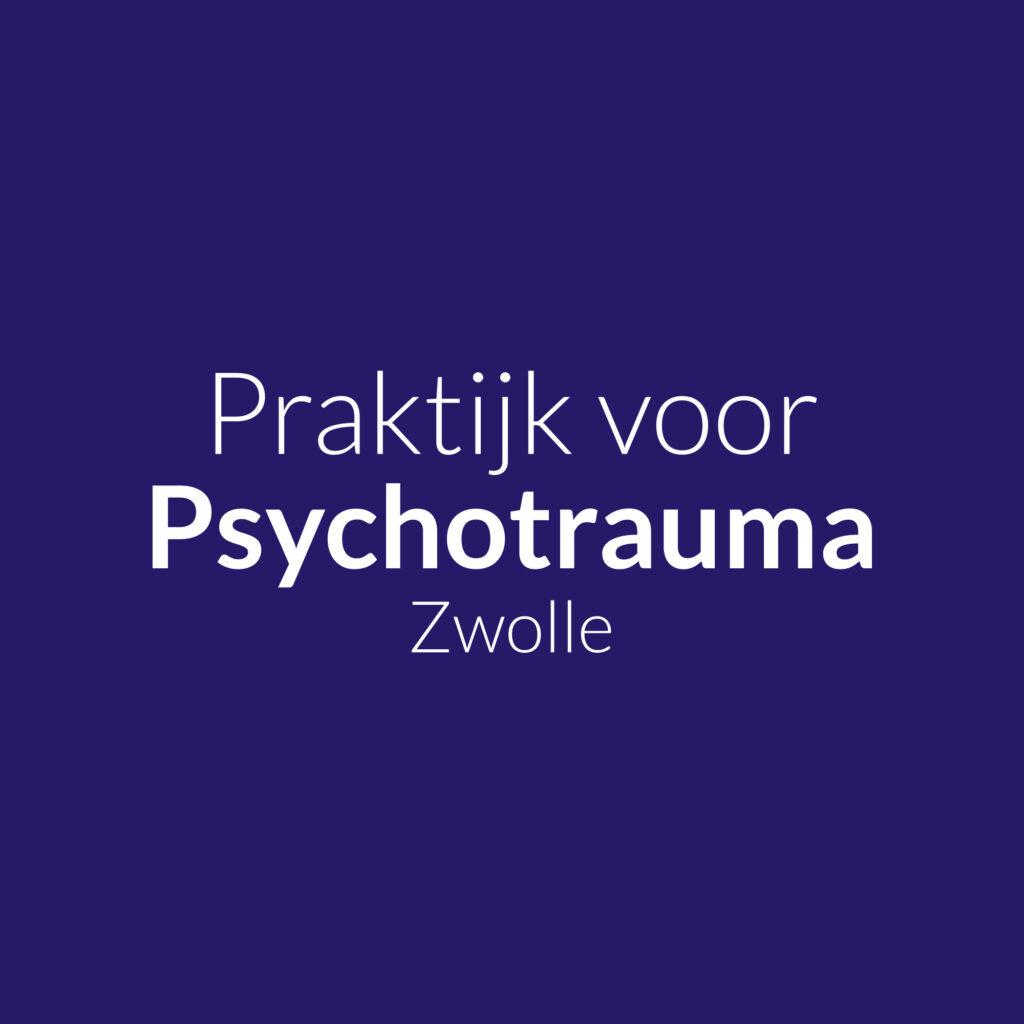
For the logo we choose a clean, simple approach. The font family I selected is Lato. This gives a clean and simple but confident and professional feel. If the practice would expanse to multiple cities the “Zwolle” could be easily updated.