
Renske and Marjolein joined forces and started a company and needed a full cross platform branding. They were searching for a coherent branding that allowed them to adress the primairy target group but wont alienate the secundaire one.
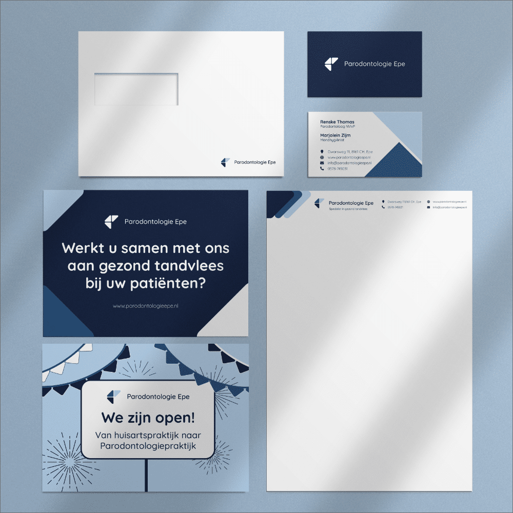
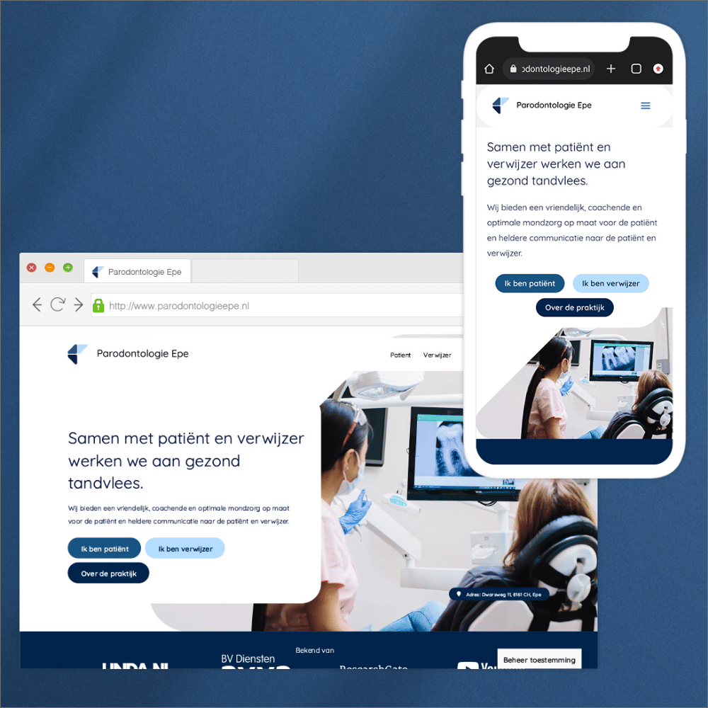
Developing a full strategy and branding with every aspect of their needs covered. Strategy, website, print, interiour, marketing.
A full on branding and strategy the owners love.
Brand identity / Print / Web design / Marketing
They offer a friendly, coaching and optimal customized oral care for the patient and clear communication to the patient and referrer.
People over 40 who have been referred by a dentist or searched for the periodontologist themselfs.
We started with multiple discovery sessions where we would sit down to uncover what their “Why” and key-values of the company would be, the direction of the company, who the target group was and what that person should feel like when getting treatment at their practice.
Based on the information I got from them I made three stylescapes and presented this to them. Along with their feedback we combined some aspects and ended up with one final version. In this stylescape:
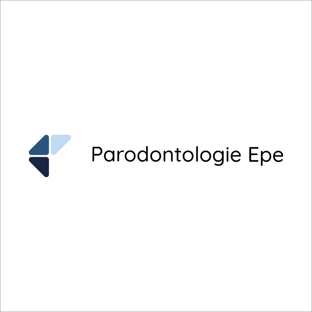
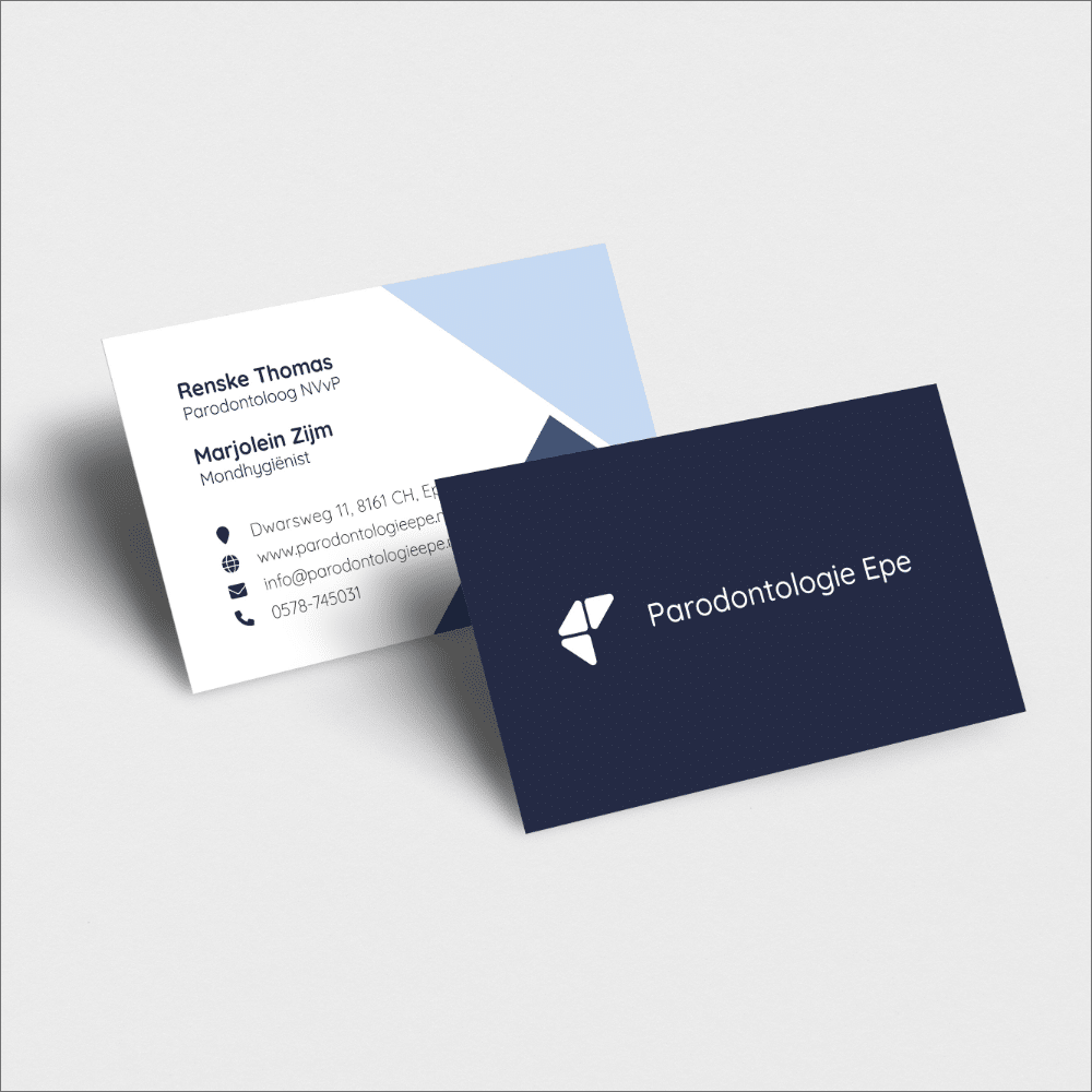
For the logo we choose a clean, simple approach. The font family I selected is Quicksand. A round and friendly font that could be used on print and web. The logo consists of 3 round triangles representing the 3 parties working in one team. The Patient, The Referrer and them The Practice. Each tint of blue represents a faction. Mid blue being the patient because they are the most important factor that the Referrer and the Practice work together to make their teeth and health better.
The three triangles, along with their diagonal cut, are coming back in the entire branding. Either shapes of color to decorate or to mask images.
I choose for three shades of blue. This color gives a sense of reliability en professionalism. Each tint represents a faction of the work environment. Light blue the Referrer, medium blue the Patient and dark blue the Practice.