
The following is the briefing of a logo-design-challenge from the creative platform Logocore.com:
Hey, Jesse!
I want to work with you on a logo design for a startup I’m launching this fall – TripleWP. For the last two years I’ve been working on a new application that simplifies the user experience of developing a website within WordPress. I choose the name TripleWP since our first beta users were able to design and update their websites around three times faster than the traditional method of writing code. The WP part of the company name is a standard abbreviation of WordPress and is an indicator to our audience of where the software can be installed. I really want to get a visual identity that is friendly, not intimidating and incorporates a typeface that reflects our cutting-edge tech. The Cloudflare logo is a great example of these ideals. In addition, a majority of the application has already been designed around a blue, white, and black color scheme that the logo should also use.
I’m not against having the design be abstract; I know it’s impossible to convey all of the software’s features in a single symbol. You should enough information to design a great logo! I’ve attached some references for visual inspiration.
I’m excited to see your logo proposal!
Jim Halpert – TripleWP
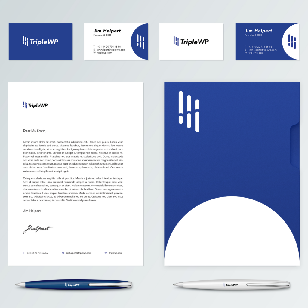
The original goal of the challenge was to design a logo. To make this personal challenge a bit more challenging I also tasked myself to create a full brand identity.
A wide cross-platform design encorporating the fundamental features and ideals of the company.
Brand Identity
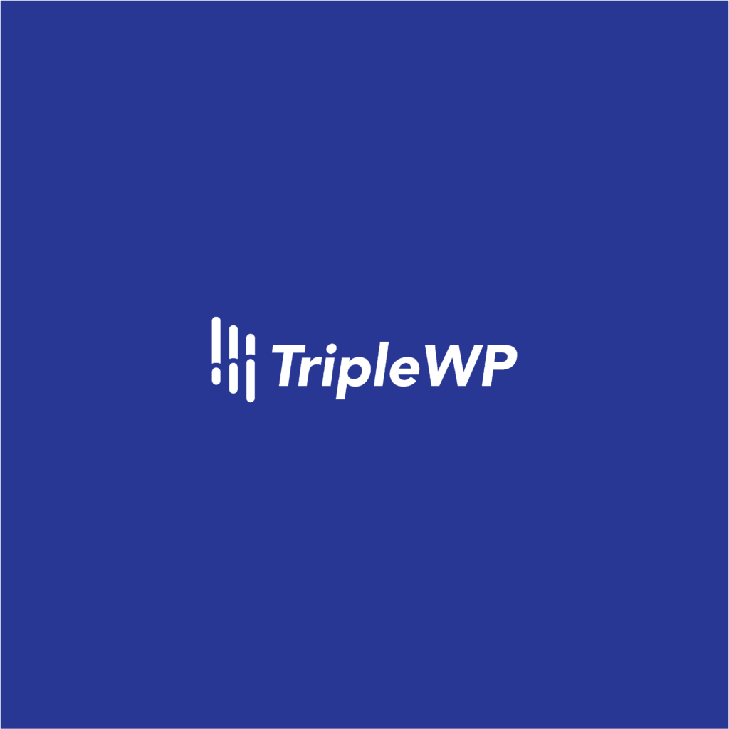
TripleWP stands for optimizing and working as a catalyst to speed up the updating progress for websites and is suitable for both individuals and companies. They achieve this by creating a plugin that takes the work and pain away from the customers. This plugin makes sure the customer has more time for important matters. This, in time, causes a growth for the company. I wanted to incorporate that growth and the coding that lays at the base of the plugin. I choose for a clean font but with a slight tilt, which shows the progress and looking the forward vision that corresponds with that of the company.
Kobalt blue is being picked as a main color. Blue stands for security and confidence. Along with black and white makes for a simple but bold colorscheme.
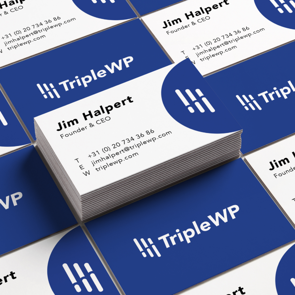
For the stationary the logo is being used in parts. Big rond strokes are added to the businesscards and folders to give the branding its signature style.